Screen Printing, Project 2
 September 2nd, 2008
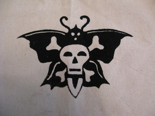
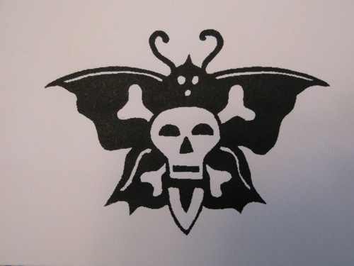
Well, I got cocky, and I paid for it. I painted my design on the screen, let it dry for a day. Then today I was ready to print! I did some testers. Then deciding they were perfect, printed a page of paper in book I made, and then a print on an old tote bag. Again, both looked great. Here they are…
Tote:

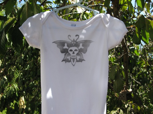
And at that point I washed the ink from the screen and let it dry. The thought was I’d wait until Dallas was home to help me hold the screen on the white onesie. This would ensure a most decent print. Well the screen dried, and I got antsy. (You have to know that I’m not sure what to do with myself these days. I feel like I’m just waiting for this baby. There isn’t much I have the energy for, so I’m getting a little stir crazy.) I figured the tote turned out just fine, how hard could a onesie be. I was sick of waiting and wanted to get the show on the road. After all, I had a blog post that needed to be written.
I’m not exactly sure how it all happened, but I had ink in places there shouldn’t be ink. It was smeared down below the image and between the antennae. I tried to wash the ink from only those places, but the fabric wicked up the water and began to saturate and smear the design – which was actually quite fine to begin with. So the back and forth began, of cleaning up one mess and making another part worse. Eventually I decided to just try to wash out the whole thing and see if I could begin again, but no. So now I have a faded design on a pretty clean background. All in all, I think it could have ended worse. Now I just like to think it looks worn in, in that faded sort of way.
So after all that, now Dallas tells me it looks a little girly. Every design I make ends up looking girly. I’m a girl after all. I thought what could be more boy than a skull and crossbones design on a dead (could be!?) butterfly. I found it online as an old sailor tattoo. Perhaps the next round I’ll do it with black ink on a olive onesie, or red ink on a little black t-shirt. Thoughts? Anyone? How can I make it look tough and boy and rock star?
Â


omit the butterfly. (duh!)
;o)
when i saw it at first, i thought it was a moth, not a flutterby…so i think it looks baby boy! red or gray onesie (assuming you will dye it yourself?) with black ink will make it look more pirate baby! very cute design.
thanks!